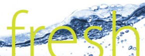
As you may have gathered by now, we choose a new word for each month to focus our content around. Our monthly newsletter features, blog post, and other social media chatter relate back to that word in some way and we change out assorted graphics in our websphere to compliment (email header, web page banner, Facebook profile image). This monthly switch presents an interesting design opportunity for me and to start our new month, I thought I’d walk you through the thought process.
So, this month’s word is FRESH. We chose these words a few months ago when we came up with the idea of using a particular word to focus content. Had I been able to I would have designed the year’s worth of assets already and had them ready to deploy. However, I have actual client work to do so I usually end up putting these together as we go. Of course, the first thing that came to mind when faced with the word Fresh was something green and botanical in nature. Our brand guidelines require that the images we use to represent ourselves be striking, colorful and somewhat unexpected and I just couldn’t find a sprouting plant image that spoke to me on those levels. I turned to water next, playing with the idea of fresh, clean, sparkling, sometimes overwhelming, all encompassing. The image I settled on has movement, great color and visual interest, fits well with our color palette and accommodates having large text set over it, which is another feature of our brand images. It will also lend itself to use in multiple configurations.
We have an extensive color palette, primarily made up of what I call ‘candy’ colors, bright, vibrant, often somewhat loud. The yellow-green is one of my favorites and I decided to use it because it compliments the blue of the water and doesn’t get lost in it. Our bright cyan blue would have been another reasonable choice, but I used it last month on the Attention graphics and didn’t want to repeat it so soon.
Those are the variables that generally go into creating a graphic: visual association with the content, framing, color, flexibility, and brand ideals. Then there is client (in this case boss) buy in. Hint: it’s easier to get sign-off if they are going on vacation the next day. 🙂
See you next month!
![cat[&]tonic](https://cat-tonic.com/wp-content/uploads/candt_logo-rw.png)


