The logo is the primary expression of a company’s brand. There is more equity in this single visual asset than any other part of the brand identity. Voice, photographic style, typography, customer service philosophy? All important, but the logo stands as the most visible, most often encountered, and arguably most important of all brand assets. A change to a company’s logo, no matter how small brings with it more discussion, more opinions and more, well, angst, than any other branding, design or communication initiative. And yet, every year, a lot of major corporations and organizations undertake to transform this most sacred of graphics. Some do it well and some stumble but we are not here to pick on the Gap or J.C. Penney, they’ve been abused enough. There is something to be learned, however, about the basic trends in graphic design from taking a look at a small set of logos that received an update or overhaul during 2013.
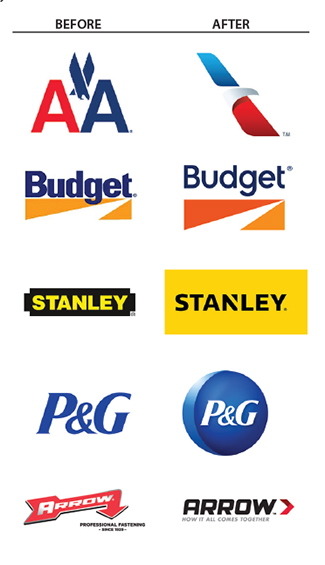
Logos don’t exist in a vacuum, they are meant to go out into the world and evangelize on behalf of their companies. And these days going out into the world means looking good on everything from a 57×57 pixel iPhone icon to a billboard. This is fueling a trend toward simpler logo designs built with cleaner, often sans serif or slab serif type which is, in general, tracked out farther than usually necessary (the spacing between the letters is wider to prevent run-together at smaller sizes). American Airlines has gone so far as to create a shape only logo. Easily recognizable without all, um, both, those fussy letters to deal with.
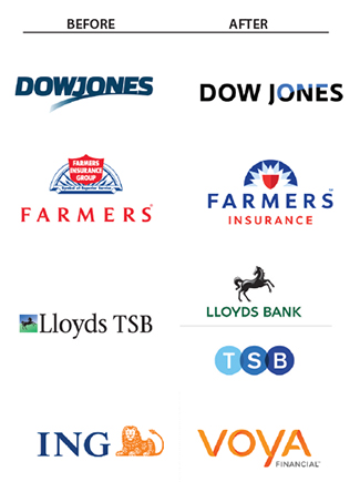
Large corporations can be hesitant to make major changes to their logos, often opting for a ‘refresh’ rather than a redesign. Even when the change is major, many companies wisely choose to reference their own history when designing the new logo. Both the new Dow Jones logo and the new Farmers Insurance logo are good examples of this trend. In the case of ING US which underwent a major name change to Voya Financial, the decision was made to keep the orange signature color in order to retain the recognition equity it carries with it from the old brand.
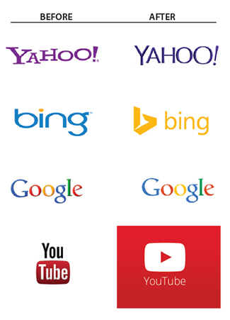
Four of the major internet brands redesigned their logos in 2013 and all provide great examples of the primary design trend for this year. After a decade of random gradients, bevels, dropshadows, and gel highlights, it appears that the design community has regained it’s sanity and flat design is making a comeback. Probably best illustrated by Apple’s interface design for the iOS 7 operating system, flat design techniques are also clearly demonstrated in the logo redesigns for Yahoo!, bing, Google and especially YouTube.