If you’ve worked in, on or around marketing for any length of time, and odds are if you’re reading this article you have been, then you have encountered the design principle of white space. As a quick refresher, the only reason that this:  is more difficult to read and looks more unprofessional than this:
  is white space. The space between elements on a page, the edge of the page (margins), between lines of copy (leading) and between paragraphs (paragraph space). Whitespace has been an important principal in print design since the beginning of the medium. Good use of whitespace quickly establishes professialism and legibility and helps guide the reader to the most important items on a page. With the massive transition from a paper dominated world to a world in which design for the screen is just as important, the old principal of whitespace is even more key to the user experience. From a design perspective white space is vital to establishing key hierarchies and promoting legibility on a page. For example, note the consistent and generous space in Amazon.com’s sidebar navigation and the whitespace surrounding separate elements on Google.com.
 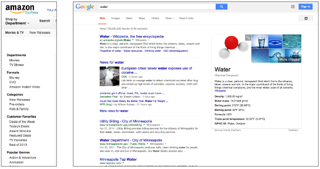 Online, white space is especially important to promoting action. For example, which button below are you more likely to push?
 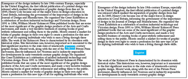 White space is also used by designers to signal content prioritization. With proper, consistent use of white space you don’t need to change fonts and colors just to signal that you are changing thoughts, allowing a design to be more legible and professional. This is especially true when you need to organize large amounts of information. CNN.com is a good example of how whitespace is used to signal changes in information type from navigation to advertising to content, and further, between featured content and subsidiary content.
 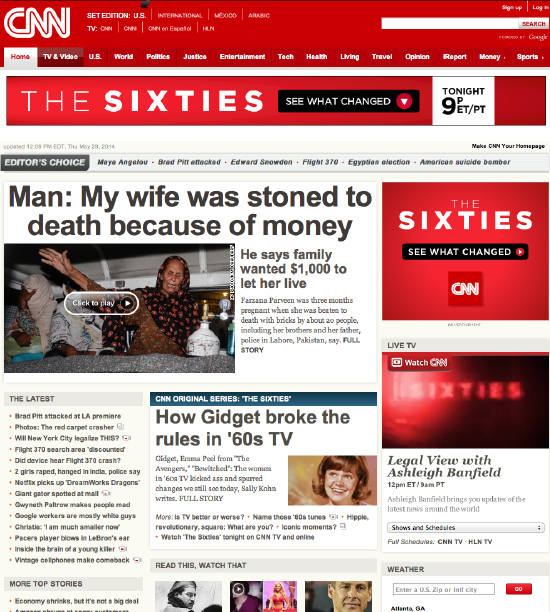 The most obvious benefit of a consistent, thoughtful use of whitespace is the perception it creates in your audience. Good use of white space immediately creates the perception of professionalism, balance, and elegance. As examples, the three sites below (Apple.com, ColdwellBanker.com, and GE.com all make excellent use of white space (remember, white space doesn’t have to be white), and all three come across as well organized, elegant, and professional, in addition to promoting action by drawing the eye to the action items or buttons.
 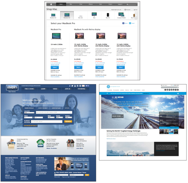 White space can make your microsite, web site or landing page more readable, usable, and effective, so the next time the urge hits you to fill every available pixel with content, try to remember: white space is not wasted space. Content with no space in between comes across as busy and noisy and is more likely to result in a visitor leaving your page than it is to get your additional point across. White space is the space where your users have an opportunity to decide to take the action you are trying to encourage.
Placeholder text is from this page on wikipedia.