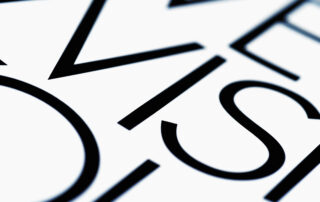
Typography matters.
Typography is a core feature of all information design, from small space ads to annual reports, even of internal memos and emails. Good typography raises the level of presentation, makes information more readable, ideas easier to follow and gives layouts flow and a sense of space. Good typography makes your [...]

Management Perspective: Elvis has left the building
This is to serve as a quick tip on presenting or receiving creative, especially when it pertains to something as sensitive and personal to people as branding and identity. Agency folks should build in some time after presenting initial visuals and creative rationale to leave the room, allowing the client [...]
2014 Global Design Trends
As a creative agency, we like to keep pulse on design trends. Shutterstock, a technology company providing photos, illustrations and videos to creative professionals worldwide, has identified the following trends for the 2014. 1) Authentic and candid photography. Photos will feature a filtered look and subjects in real-life settings. 2) [...]
Trends in Logo Redesign
The logo is the primary expression of a company’s brand. There is more equity in this single visual asset than any other part of the brand identity. Voice, photographic style, typography, customer service philosophy? All important, but the logo stands as the most visible, most often encountered, and arguably most [...]

Expression on demand recharge.
Beth is the art director at d.trio. Art Director. That’s the title on my business card. To people who don’t know better I’ll bet it summons up images of daily creative breakthroughs, someone who does magic with things called pixels and PMS colors. A person obsessed with light and print and [...]

Management Perspective: Choosing A Dance Partner
One seemingly complex issue often facing marketers is how to go about picking the right agency with which to work. True to my obsessive drive to simplify, I’ve attempted to break the process down to something easy – ergo, the “Three C’s.” Cost, Capability and Chemistry are my “Three C’s”. [...]
What’s Make a Campaign Fresh?
We’ve all heard the adage “there are no new ideas; there are only new ways of making them felt.” Whether it’s true or not, we all face the daily challenge of finding unique and compelling ways of getting our message, and our clients’ message, noticed. What makes an idea or [...]
Fresh month, fresh theme.
As you may have gathered by now, we choose a new word for each month to focus our content around. Our monthly newsletter features, blog post, and other social media chatter relate back to that word in some way and we change out assorted graphics in our websphere to compliment [...]
RED. Got your attention?
We all know that red is one of the most attention grabbing colors in the spectrum, used for centuries (ok, decades) in eye catching bursts and to highlight text that has been designated as needing to POP! It is also the primary or main accent brand color for many companies, [...]

Concept Graveyard – when great concepts aren’t
I’ve been a designer for 14 years now (yikes!). During that time I’ve come up with some really good designs, some designs that weren’t my favorite but got the job done, and some concepts that I really, truly, loved. We typically show two to three concepts for each project (way [...]
