Anyone from Minneapolis or Atlanta can’t help but notice how well the restaurant and bar industry is doing. In fact, for better or worse, Minneapolis was recently named America’s Coolest Drinking City. Which I was sure was a joke about our weather at first… But with restaurants coming and going rather frequently and the popularity of dining out continuing, it wouldn’t be surprising if the effect of a good logo isn’t just a bit stronger here.
Marvel bar in the North Loop neighborhood certainly isn’t trying to stand out and get a lot of attention with its tiny and nearly hidden location, but its logo definitely caught my eye.
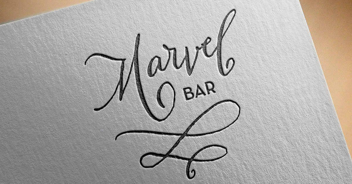
![]()
Located virtually in the basement of the restaurant The Bachelor Famer, Marvel Bar is one of the many prohibition-style cocktail lounges that have been springing up around Minneapolis. The brand that has been quietly built around Marvel Bar is quite interesting.
Since the advent of material design and logos focusing on crisp display on any device we haven’t seen much in new logo styles beyond clean sans-serif fonts, let alone any textures that don’t translate well to the size of a tiny phone app. Marvel Bar’s logo bucks most of these trends and sticks to a classic script with a rough texture. These decisions represent the authenticity and confidence that are without a doubt the bar’s calling card.
The simple calligraphic flourishes could be seen as whimsical representations of mixing cocktails as well. The lower vertical bars on the sans serif font for “Bar” also lend to the classic look. Overall the logo is very light and works best with a lot of space around it. While Marvel Bar may be content with remaining lower key, it’s hard to miss how well this logo stands out from the regular bar crowd.