Like many designers, I often find myself evaluating the various brands, print media, and digital media that I encounter on a daily basis. Tearing into every detail I try to discern what was intentional, what was not, what works, and what looks terrible. A trait that my close friends probably find insufferable at this point. It is often a futile effort in the short time I afford it. After all, when it comes to design context is king/queen. I do, however, find this overly-analytical view of my immediate surroundings to be vital in keeping my mind fresh with ideas. Some of my best designs come from the synthesis of ideas I expose myself to.
So, I thought I’d share some of the more interesting designs I encounter day-to-day. Focusing on the logos around Minneapolis, MN. My subject today is a logo that caught my eye the first time I saw it while riding the Green Line to St. Paul one day. It stood out very clearly amongst the dated shop signs around it.
![]()
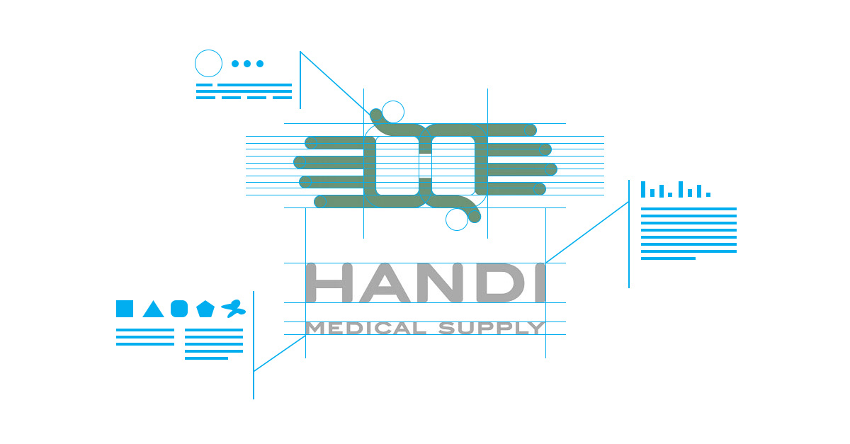
A medical supply store in St. Paul that offers a wide range of at-home and hospital medical supplies. The soft edges of this logo give it a welcoming feel that meshes well with the company’s focus on providing products that make living at home with disabilities more manageable. The double meaning of the mark, both hands and an “H”, create a unique form. It ties well to the idea of “giving a hand” as well as subtly alluding to wings and the independent freedom their products can help provide. It’s harder to make out the exact reason for the choice in colors, but they are not too vibrant or harsh and help give the logo a soft feel. The larger font matches the rounded features of the mark while the smaller font brings a bit of contrast with some sharp edges that also make it more legible at smaller sizes. The logo also works well in different orientations and has room to grow into different forms.
![]()
![]()
I’m a sucker for logo marks that have multiple meanings, and this one does a good job of considering the ideas and emotions the logo is meant to evoke, especially for the industry they are in.