For those who have read my logo posts before, you may have noticed I have an affinity for well-designed sports logos. I have written a post gushing about the MN United logo. It would not be wild to draw the conclusion that I really love sports… Sports are great, don’t get me wrong, but the fact that I had no idea this team even existed should probably tell you everything you need to know about my fanaticism. The truth is, sports logos just look FUN AS HELL to design.
![]()
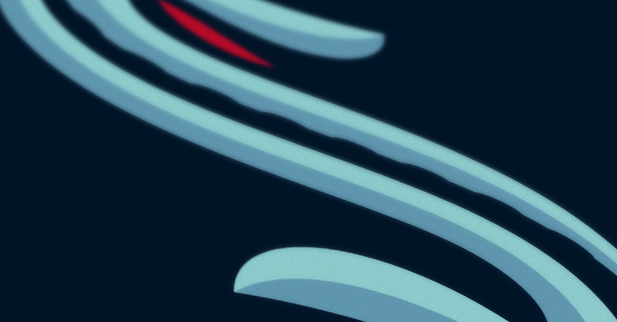
The Seattle Kraken is the latest NHL team—expected to play their first season in 2021-2022—and its logo is easily one that I wish I had designed. The various elements that make up this stylized “S” reek of designers having fun. The hidden tentacle used to add a calligraphic effect, the kraken’s sinister “eye”, and the bevel that resembles the shaped metal of an anchor all help amp up the logo’s perfect-for-sports qualities. It’s edgy, active, and aggressive. The color choices are also great for the nautical theme and are believable as a Seattle-inspired palette. The website they used to reveal the identity does a great job highlighting all the features of this logo and identity. I’m excited to see how this brand will expand from such a great logo. If the designers responsible for the logo have more to say about future branding I can promise it will be exciting.