THE TASK:
Redesign the Alliance Bank brochure collateral system to create an updated, modern look that is distinctive, represents the brand and is flexible enough to be relevant across products. Each brochure needs to look unique while at the same time complementing the others in the series.
THE RESULT:
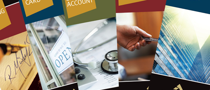
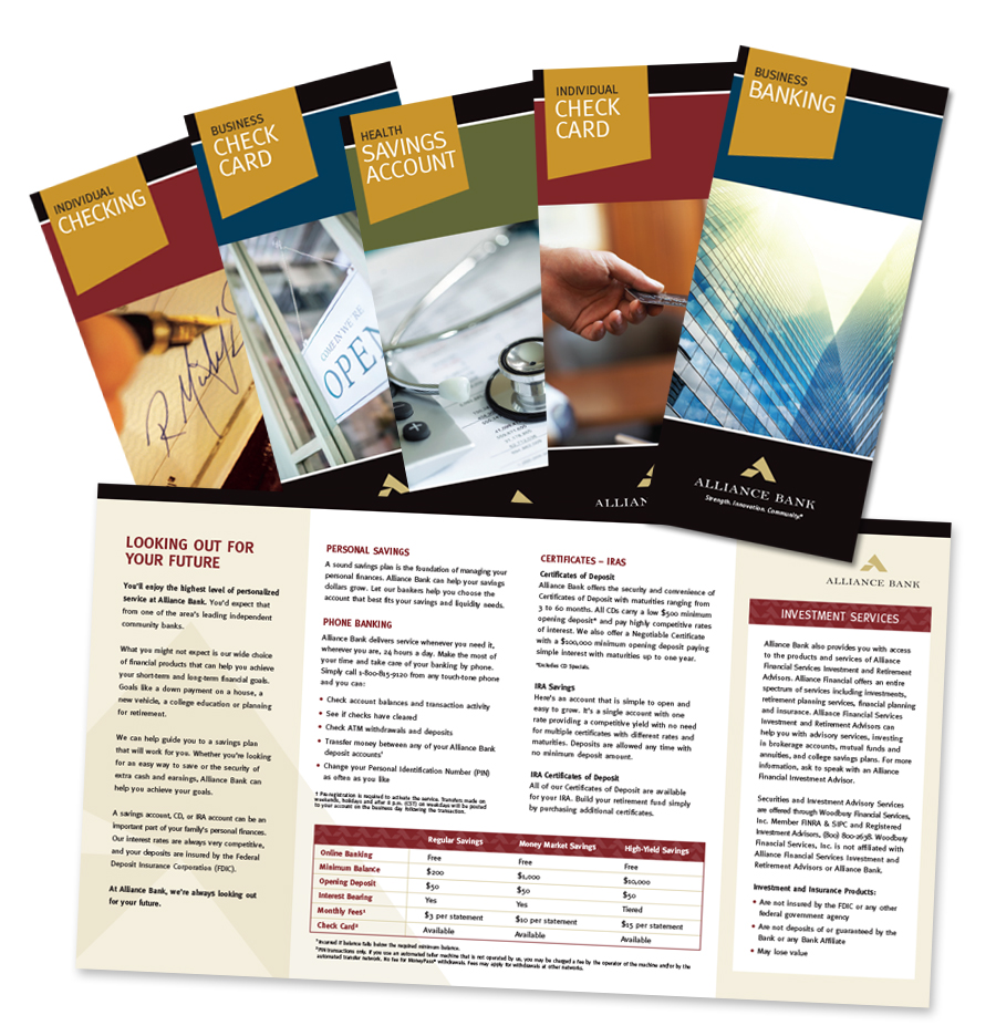
We took a brand forward design approach. The gold tab shape echoes the Alliance Bank branding, frames the product name and provides consistency between the pieces. The accent colors create visual differences between the brochures, and the closely cropped images relate directly to the subject matter. The black band at the top of each piece, as well as the use of white space and sans serif typography, provides a clean, modern look.
About the Author: cat-tonic
Born of curiosity and enthusiasm, we’re a scrappy group of smart, passionate marketers who work hard and play hard. We show up every day and fight for our clients who are making the world a better place. We listen with curiosity, explore deeply, ask hard questions, and sometimes put forth ideas that might make you squirm. Because we believe the status quo is good for growing mold but not much else.
The way we see it, change is the way forward and the magic happens when curiosity, math, science, instinct, and talent intersect.