Graphic design as an industry is driven by trends. Designers keep an eye on what’s happening on the runway and on TV, they watch how people interact with new technologies and how their audiences intake information. Then they apply the best of what’s happening to the creative strategies they execute for clients, creating graphic design trends in the visual landscape. These trends tend to overlap and ebb and flow, but in general can be broken down by decade. For example:
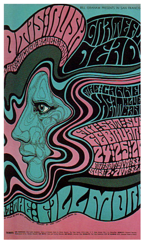
60s – complex illustration styles bridging the gap between psychedelic inspired concert design and earth tone based advertising.
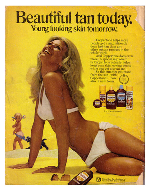
70s – Farrah Fawcett, disco influences, and the advent of photography-centered advertising.
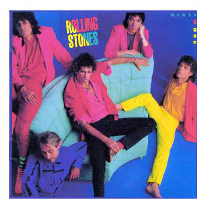
80s – bright pastels and jagged, blocky type. You remember Miami Vice, don’t you? Even the Stones got in on the act.
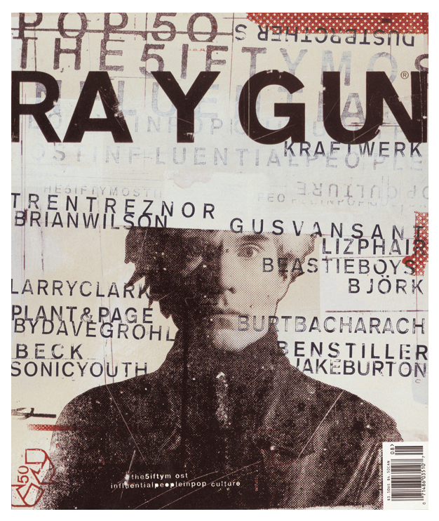
90s – advances in technology like Photoshop and PageMaker gave designers the tools to experiment like never before. Grunge culture influenced everything making this decade difficult to pin down visually; though it’s pretty obvious the design industry has never been the same. If you see a bevel and a drop shadow and a gradient, or something with ripped edges, you’re probably looking at a piece from the 90s.
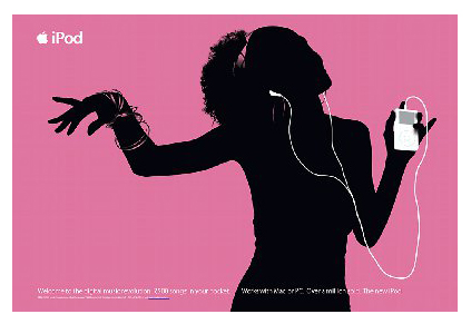
2000 – design for the web had a major influence on all design and the need to ensure everything looked good no matter what screen it was viewed on created a movement toward simpler layouts and cleaner styles. This style came to be known as flat design. Outside of the professional design world, the proliferation of tools available to non-designers not only allowed masses to express themselves visually to a wide audience, but also created a large gap between acceptable design and good design.
And so now we find ourselves in the second decade of the 2000s. Flat design has evolved into Flat 2.0, driven by Apple and made ubiquitous by the introduction last year of Google’s Material Design. Material Design is a set of design principles based on the foundational elements of print design — balance, grid, alignment, hierarchy, light and surface. In short, Google has put their considerable weight behind reminding the world that graphic design as a medium is only good if it enables and promotes understanding of information and the ability to take an action based on that information. If you’re interested, the full spec for Material Design is available here.
Trends come and go and evolve over time. A few other trends that have been growing over the past few years will really find their groove over the next year. Such as:
Type forward.
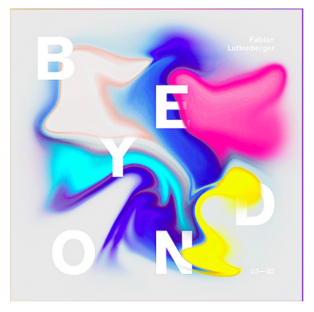
The use of typography as a dominant graphic element has really blossomed recently and the availability of good quality typefaces and a far-reaching adoption of web fonts will only make this trend stronger. Look for bold, interesting typography that adds really interesting depth and dimension to all that flat design.
Bright colors.
This one’s been coming for a while now, again perhaps an influence of flat design. Designers are doing a great job of finding interesting color combinations without going quite as garish as say, the 80s. (d.trio was in at the beginning of this one, if you’ve ever seen our offices or our identity system :))
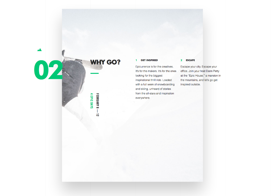
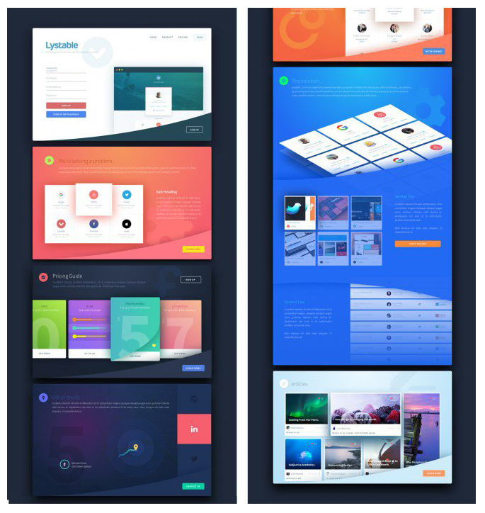
Modular design or tile based design.
Think Microsoft 8, or Pinterest here and you’d be right. Using tiles as self-contained panels of information inside a larger grid structure provides an easy way to develop flexible, responsive layouts and is very popular as an offshoot of parallax (long scroll) web design.
These trends give us a pretty good indication of what our visual landscape will look like over the next few years. As always, designers need to be careful of the trends they follow. Jumping onto something just because it’s popular is a sure way to not only date your work, but to fade into a sea of sameness. If, like us, you do the majority of your work for large corporations with well-established brand guidelines, trends can still provide inspiration for layout and typography usage that can keep your design relevant and fresh. And can help you be ready when one of your “conservative” clients wants to change things up like one of ours recently did by introducing a new color palette full of bright hues like fuchsia and teal.
For more on popular trends in graphic design, check out the Canva Design School blog, and Inspiredology.com.
Images from:
https://designschool.canva.com/blog/design-trends-2016/
http://inspiredology.com/graphic-design-through-the-decades-the-00s/
http://techcrunch.com/2014/06/25/google-unveils-new-cross-platform-design-language-material-design/