When I was young and still learning about how a computer could be a creative outlet for design and illustration, I remember using CorelDRAW. It was one of the few pieces of software my dad was willing to shell out the cash for (most likely from the bargain bin at the local Best Buy).
While using it was frustrating (like most PC software at the time) I remember being mystified by what it was capable of. To this day I probably associate the image of a hot air balloon flying over a picturesque landscape with imagination and creativity. That makes it somewhat difficult to remain completely unbiased in reviewing Corel’s recent rebrand/rename to Alludo but I am compelled to try.
The new name
We’re no strangers to renaming. If you haven’t heard, we recently changed our name to cat&tonic. We’ve also helped several clients rename their companies and business lines. So, examining Alludo’s reasons for changing their name and brand is quite relatable.
For some time Alludo has offered products that do more than just creative production, including office efficiency software like WinRAR. Since Corel existed it has been associated with the creative side of their business, so the new name is welcome. It’s ambiguous enough to work for their more diverse offerings but also sounds like allude or allow. Two words that work well to represent their stated mission, “Our software liberates people and organizations from everyday constraints to reimagine where, when, and how we work.”
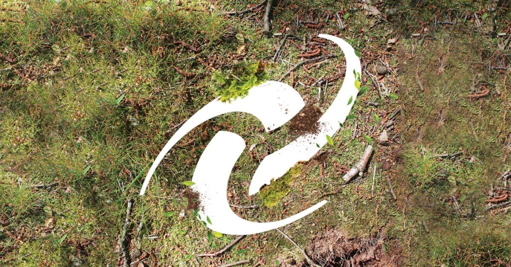
The new logo
The logo is where things get a little too ambiguous for my tastes. The shape is somewhat interesting and at least the forms are mirrored in the wordmark, but overall, it feels confusing. Admittedly this is where I have the most biased because I loved the balloon. The double arced shape just feels unfinished.

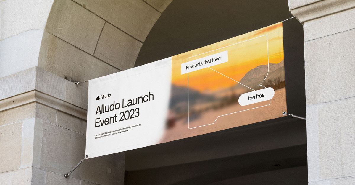
The brand elements
The rest of the brand design, especially the animations, are fantastic in my opinion. I love the execution on “blurring boundaries”. The images created through combining stock photography, shape, color, and blurring feel very inspired. While most of my connotations with blurring the boundaries of work are negative, I can’t help but appreciate how these elements come together. Ironically, they do feel more “creative concepting” in nature and that pulls the brand back in the direction of Corel rather than Alludo.


Overall, I feel this update was overdue and a lot of interesting work was put into the rebrand. I don’t love the logo, but perhaps Alludo will grow into it. It’s fun to see a brand I was familiar with as a kid still kicking—especially in the creative world where Adobe has stifled its fair share of competition.
Assets shown are the property of their respective owners. Rebrand materials were created by DesignStudio and are owned by Alludo.